Color alternates
The logo should use the red flame whenever possible. However, in circumstances that do not allow it, the University logo can be set in any of its mono variants that is best suited for optimal legibility.


Minimum sizes
Avoid using the logo below the minimum sizes specified.


Core identity straplines
In some cases, we use versions of the logo locked-up with a strapline element. Both straplines, ‘Founded 1925’ and ‘A Member of the Claremont Colleges’ are custom artwork set from the brand’s Gotham typeface and should not be typed out. For consistency, three-line and single line versions have been created to use.


Schools and related entities
A lockup system has been devised to encompass most of the organizational aspects of Claremont Graduate University. The elements grow upwards from the core identity and build in a hierarchical fashion, leaving the core identity clear and visible.
Named schools
Named Schools, such as Drucker School of Management, employ a larger Gotham set in bold to emphasize its nature.

Unnamed schools
Unnamed schools such as School of Arts & Humanities employ a smaller Gotham, set in Book and with the School’s subject highlighted in Bold.

University-level entities
University-level Entities such as Department of Botany employ the same identity treatment as unnamed schools.

Secondary entities
Lab, program or other initiative
Some Labs, programs and other initiatives are separate entities and have no affiliation to a School, we set these to Lyon, 50% tint below the main identity.

When these are affiliated with a school we refer to the lockup system in Gotham Book, 50% tint of Black.

Administrative units
Administrative Units are set in Lyon Italic, 50% tint of Black and are below the main identity. This emphasizes the prestigious nature of the institution.

Alternative forms such as the 3-line stack and the single line are reserved for space-constrained situations.

Student associations
For Student Associations we use the informal acronym for CGU and set all the Associations in Gotham Narrow, Light at 50% tint of Black. Aligned to the right, this differentiates itself from the formal lockups. Alternative lock-ups start with the Association first then the CGU acronym identity.

Additional logos
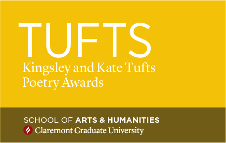
Events, Prizes and similar identities can be created along relatively free lines provided that they are relatively spare in their use of graphic elements, taking special care to avoid clichés and generic symbols. Such identities can be created with either Lyon or Gotham typefaces, or a combination thereof.


