Our identity is thoughtfully composed of the flame symbol and the CGU wordmark.
To use any of the university logos in your materials, please download the logo package from the Request Forms & Downloads page.
Flame
The stylized flame, contained in a bold red circle, is our primary identity marker. It harkens back to the founding of the Claremont Colleges, and its motto: Multa Lumina, Una Lux (Many lamps, one light), of which the Graduate center was a founding member. Today, the flame is the modern symbol that conveys the passion of our students, faculty and staff in the pursuit of knowledge.
As part of the new visual identity system, the flame is always to be set in white, contained in a red circle.

Wordmark
The CGU wordmark is set in an elegant typeface, Lyon, by Kai Bernau, that was inspired by the work of Robert Granjon, a master of Renaissance typography. It has a sophisticated, mature and academic character which is well suited to our institution.
The wordmark is custom typeset artwork and should never be typed out. The wordmark comes in two forms: one-line or three-line. The one-line treatment is preferred, and should be used by default. The three-line version is best suited to contexts where only a narrower aspect ratio is available, or where using the one-line version would cause the wordmark to be too small.


Shield
As the institutional symbol used in some form since the university’s founding, the shield is the perfect testament to our enduring passion and excellence as an institution. It is used in rare instances such as building signage. It is never to be used as the core identity.

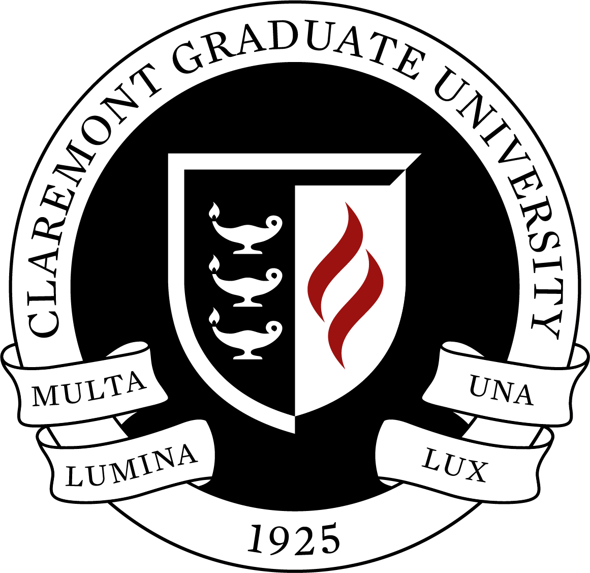
University seal
The university seal is approved for extremely limited use, and cannot be used as a substitute for the university core identity in printed publications or on the web. It is intended for official administrative materials, such as diplomas and transcripts.